

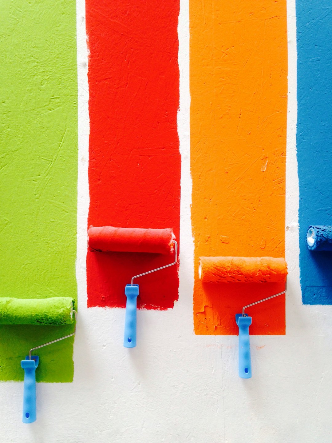
Color-blocking isn’t just for the fashion world; it’s a dynamic and bold way to transform your living space into an artistic masterpiece. By strategically using contrasting colors, you can create drama, define spaces, and highlight architectural features. Here are 15 exciting color-blocking techniques that will elevate your interiors to a new level of sophistication and style.
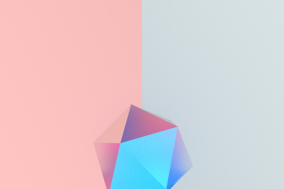
The 50/50 Split
Imagine dividing a wall into two distinct halves, each painted in contrasting hues. This technique, known as the 50/50 split, offers a striking and graphic look that catches the eye. You might choose a vibrant red on one half and a calming blue on the other, creating a visual balance that’s both stimulating and soothing. This method works wonderfully in spaces where you want to make a bold statement without overwhelming the senses. It’s like having two personalities cohabiting a single space, each color reflecting a different mood or time of day. The key is to maintain a clean line between the two shades, making sure the contrast is clear and defined.
Color-Blocked Ceiling
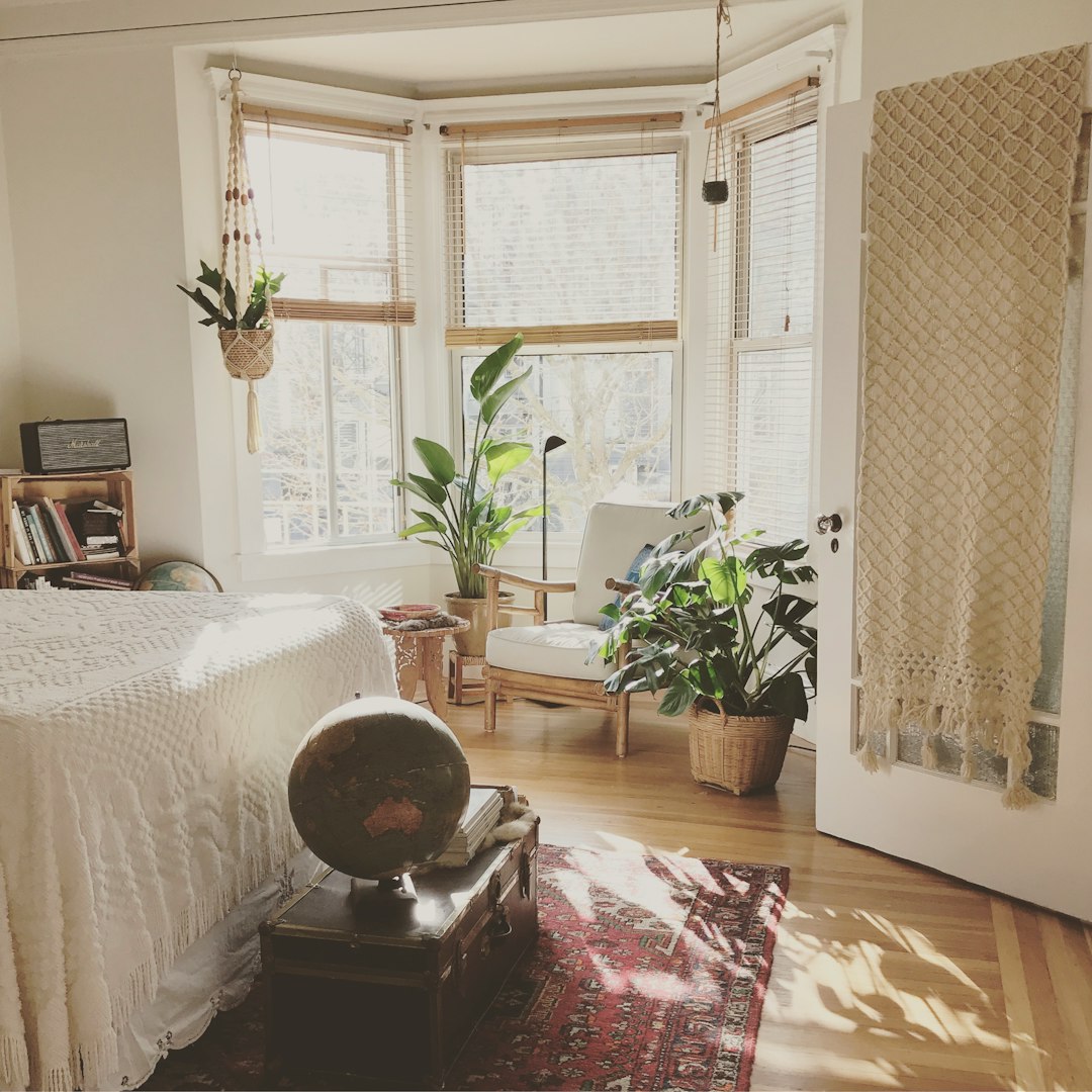
While many people focus on walls, the ceiling often remains an overlooked canvas. By painting the ceiling a bold hue, you can draw the eye upward and add a sense of drama to any room. Imagine a deep emerald ceiling paired with soft white walls; the effect is akin to looking up at a lush canopy, bringing a touch of nature indoors. This technique allows the ceiling to become a focal point, creating an intimate and cozy atmosphere. It’s perfect for rooms where you want to evoke a sense of luxury and grandeur, like a dining room or a bedroom. Remember, the bolder the color, the more impactful the statement.
Architectural Accents
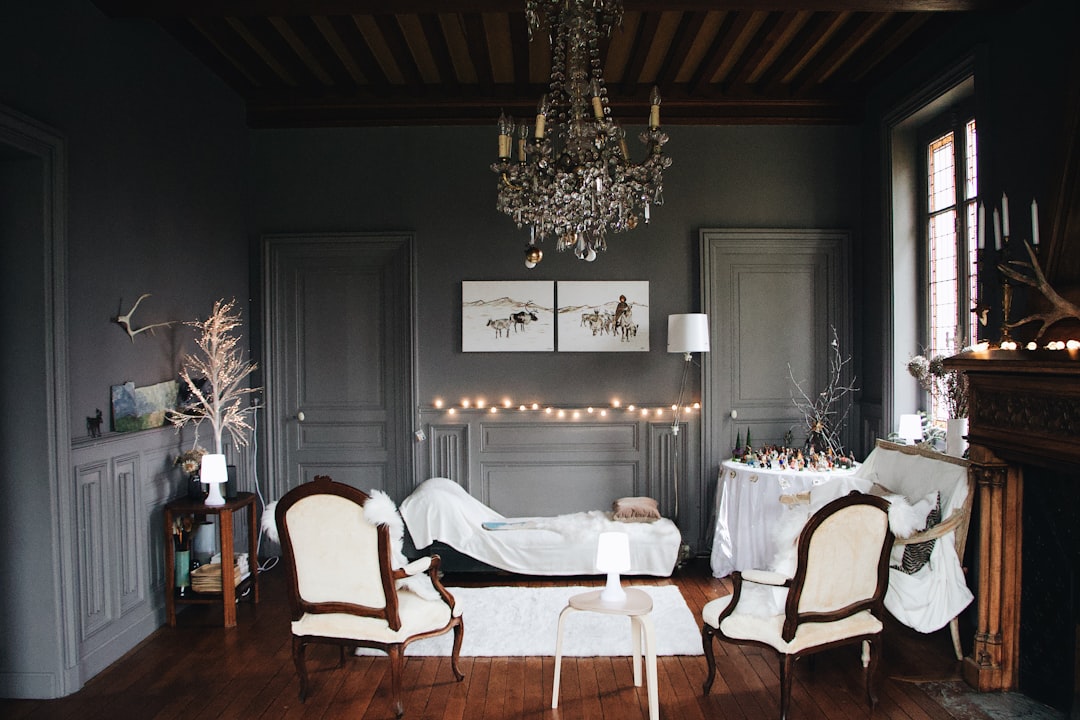
Architectural elements like trim, moldings, door frames, and archways can be accentuated with contrasting colors to frame a space beautifully. This technique highlights these features, turning them into works of art in their own right. For instance, a stark white room with black trim creates a crisp, modern look that’s both classic and contemporary. It’s like adding a frame to a painting, drawing attention to the details that might otherwise go unnoticed. By choosing colors that complement each other, you can enhance the architectural beauty of your home and add depth to your design.
Zone Definition
In open-plan spaces, color-blocking can be used to define different areas, such as a reading nook or dining space. By painting a section of the wall in a distinct color, you create visual boundaries that help organize the layout. This technique is particularly useful in homes with limited space, where every square foot counts. Imagine a soft lavender corner for relaxation and a bold orange area for dining; each color signals a different function and mood. It’s like creating invisible walls that guide the flow of movement and energy within the room, making the space feel more intentional and cohesive.
Ombre Gradient

For those who prefer a softer approach, the ombre gradient technique offers a seamless blend of two or more colors. This method creates a smooth transition that adds a soft yet bold visual effect to any room. Picture a wall that fades from a gentle sky blue at the top to a rich navy at the bottom, evoking a sense of depth and tranquility. The gradual change in color can mimic natural phenomena like sunsets or ocean waves, bringing a touch of the outdoors inside. This technique is ideal for spaces where you want to evoke a sense of calm and serenity while still making a statement.
Graphic Geometrics
Incorporating shapes like triangles, rectangles, or circles in vibrant colors can turn a plain wall into a statement piece. This technique is all about creativity and expression, allowing you to play with patterns and designs. Imagine a series of bold yellow triangles on a soft grey background; the result is a dynamic and energetic look that captures attention. It’s like turning your wall into a canvas, where each shape tells a story or conveys a feeling. This method is perfect for spaces that need a touch of whimsy or artistic flair, such as a child’s room or a creative studio.
Contrasting Doors & Windows
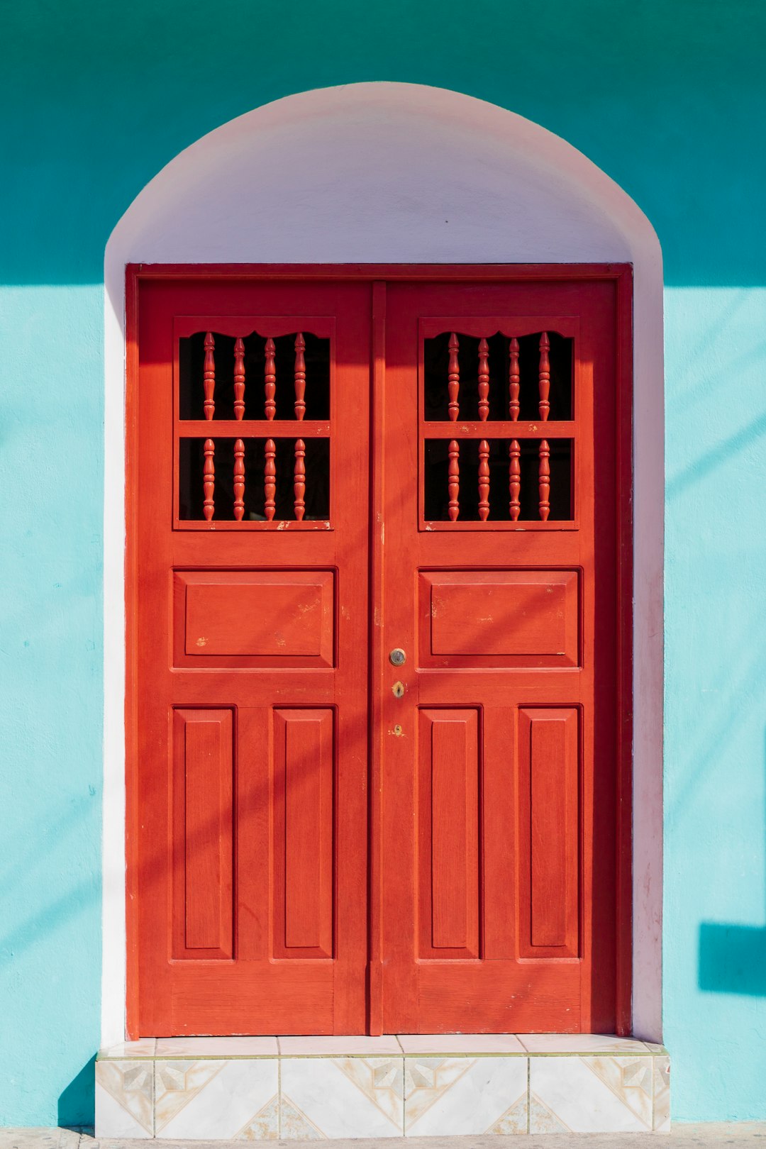
Painting doors and window frames in bold colors against a neutral backdrop creates a modern and stylish contrast. This technique emphasizes these features, making them stand out as unique design elements. Imagine a room with crisp white walls and a vivid turquoise door; the door becomes a focal point, adding character and charm. It’s like accessorizing an outfit with a statement piece, where the contrast highlights the beauty of each element. This method adds a touch of elegance and sophistication to any room, making it feel more polished and complete.
Half-Wall Painting
For an elegant and understated effect, consider applying color only to the bottom half of the wall, leaving the top white or neutral. This technique creates a subtle contrast that’s both refined and modern. Picture a room with a soft blush pink on the lower half and a crisp white on top; the result is a gentle, soothing ambiance. It’s like wearing a chic two-toned outfit, where each color complements the other, creating harmony and balance. This method is perfect for spaces where you want to maintain a sense of openness and lightness while still adding a touch of color.
Furniture Color-Blocking
Pairing furniture pieces in bold, complementary colors can create a lively and energetic space. This technique allows you to experiment with colors without committing to painting walls or ceilings. Imagine a living room with a bright teal sofa and a sunny yellow armchair; the result is a vibrant and playful atmosphere. It’s like mixing and matching clothes to create a unique and personalized look, where each piece adds to the overall aesthetic. This method is ideal for those who love to change their décor frequently, as it allows for flexibility and creativity.
Monochromatic Blocking
Using varying shades of the same color can create depth and dimension without overwhelming the space. This technique offers a more subtle approach to color-blocking, where the focus is on tone and texture. Picture a bedroom with walls in different shades of blue, from soft sky to deep navy; the effect is serene and cohesive. It’s like listening to a symphony where each note blends seamlessly with the next, creating harmony and unity. This method is perfect for spaces where you want to evoke a sense of calm and tranquility while still adding visual interest.
Ceiling-to-Wall Flow
Extending a color from the wall onto the ceiling can create an enveloping, cocoon-like feel. This technique blurs the boundaries between wall and ceiling, making the space feel more intimate and cozy. Imagine a room where a warm terracotta color flows seamlessly from the walls to the ceiling; the result is a comforting and inviting atmosphere. It’s like wrapping yourself in a warm blanket, where the continuous color creates a sense of security and comfort. This method is perfect for spaces where you want to create a sense of enclosure and warmth, such as a bedroom or a reading nook.
Unexpected Pairings
Combining unconventional color duos can result in high-impact and memorable interiors. This technique encourages you to think outside the box and experiment with bold combinations. Imagine pairing mustard yellow with deep purple or navy with coral; the result is a dynamic and eye-catching contrast. It’s like mixing flavors in a dish, where unexpected pairings create a unique and memorable taste. This method is ideal for those who love to take risks and make bold statements with their décor, turning their home into a reflection of their personality and style.
Built-In Color Accents
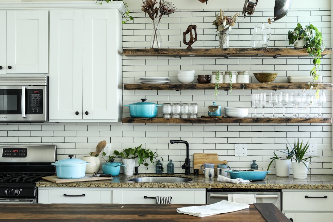
Painting built-in shelves, cabinets, or kitchen islands in contrasting shades can make these features pop. This technique highlights these elements, turning them into focal points within the room. Imagine a kitchen with a deep blue island against white cabinets; the island becomes a centerpiece, adding depth and character. It’s like highlighting a key ingredient in a recipe, where the contrast draws attention to the beauty of each element. This method is perfect for spaces where you want to showcase specific features, making them stand out and adding visual interest.
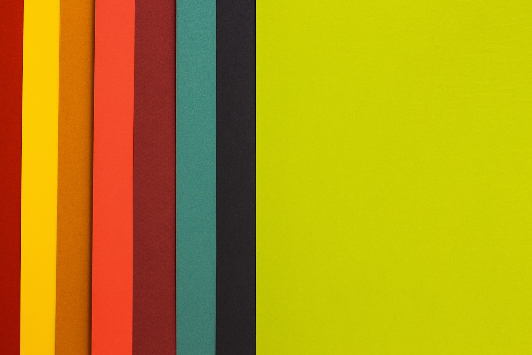
Stripes & Patterns
Adding vertical or horizontal stripes in bold hues can create movement and elongate a space visually. This technique offers a playful and dynamic approach to color-blocking, where patterns add energy and excitement. Imagine a room with vertical black and white stripes; the effect is chic and modern, drawing the eye upward and creating a sense of height. It’s like wearing a striped outfit, where the pattern adds personality and flair. This method is perfect for spaces where you want to add a touch of sophistication and style, making them feel more vibrant and lively.
Textured Color-Blocking
Using different finishes within a color-blocked design can add depth and interest to the space. This technique combines matte, gloss, or textured paints to create a multi-dimensional effect. Imagine a wall with a matte grey base and glossy black accents; the contrast in texture creates a rich and luxurious look. It’s like mixing fabrics in fashion, where the interplay of textures adds richness and complexity. This method is perfect for those who love to experiment with tactile elements, adding a sensory dimension to their interiors.

A visionary in modern design, Nate Berkman is known for his ability to blend timeless elegance with personal storytelling. With years of experience in high-end interiors, his book Living with Style explores how to create meaningful spaces that reflect individuality.