
The Fashion Revolution That Nobody Saw Coming
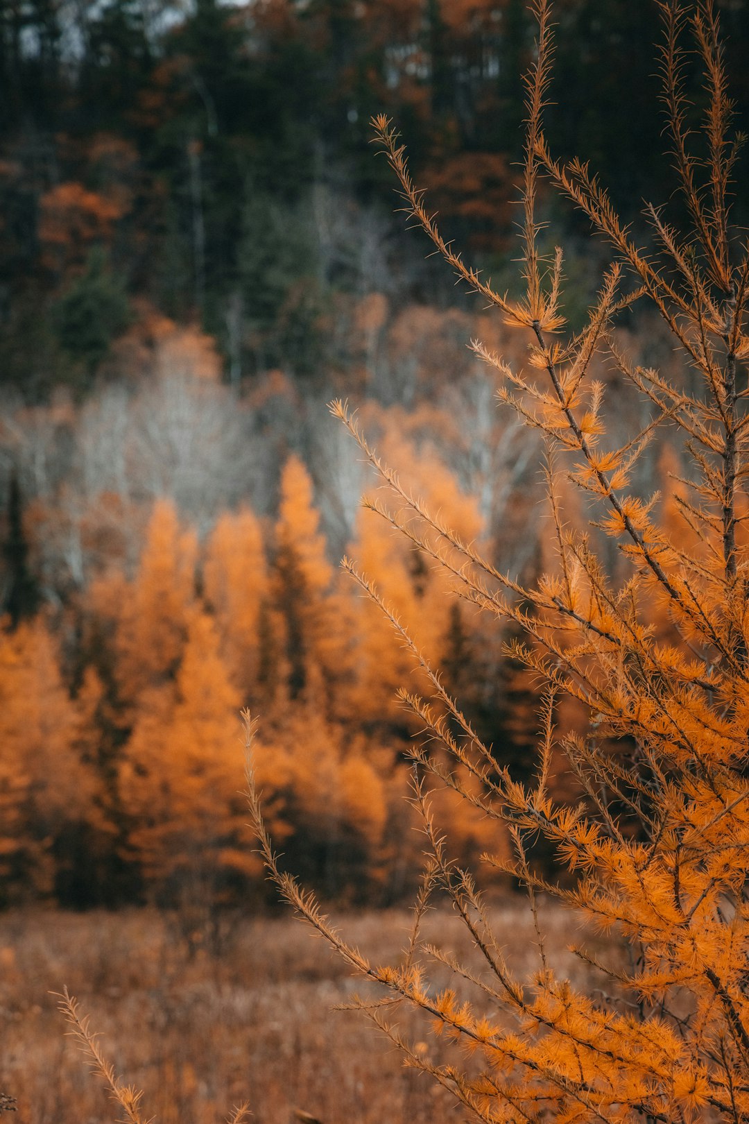
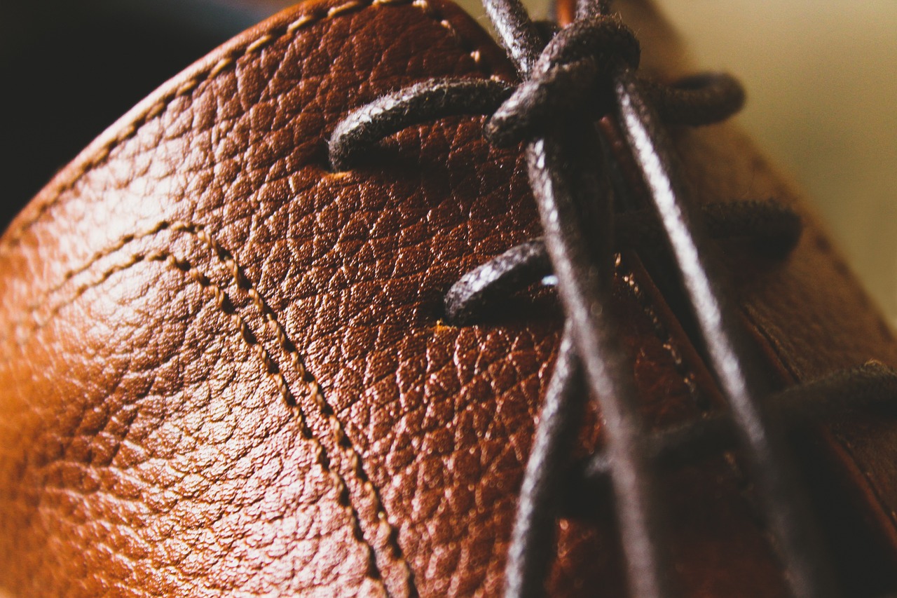
Remember when everyone thought earth tones were boring? When beige was basically a bad word and brown was something you only wore when nothing else was clean? Well, hold onto your neutral-colored hats because the fashion world just pulled a complete 180. 2025 is set to be the year of earth tones, with these natural hues dominating everything from runways to living rooms. This isn’t just some fleeting trend that’ll disappear faster than your favorite sweater in the dryer. Earth tones continue to make a profound impact in the world of design, with their remarkable ability to evoke feelings of warmth, comfort, and stability. The colors that once screamed “boring” are now whispering “sophisticated,” and honestly, we’re all ears. Rich, chocolate brown will play a starring role in 2025, as this timeless neutral is among the easiest to style and manages to feel a bit more refined than a simple black or charcoal gray.
Why Celebrities Can’t Stop Wearing Brown
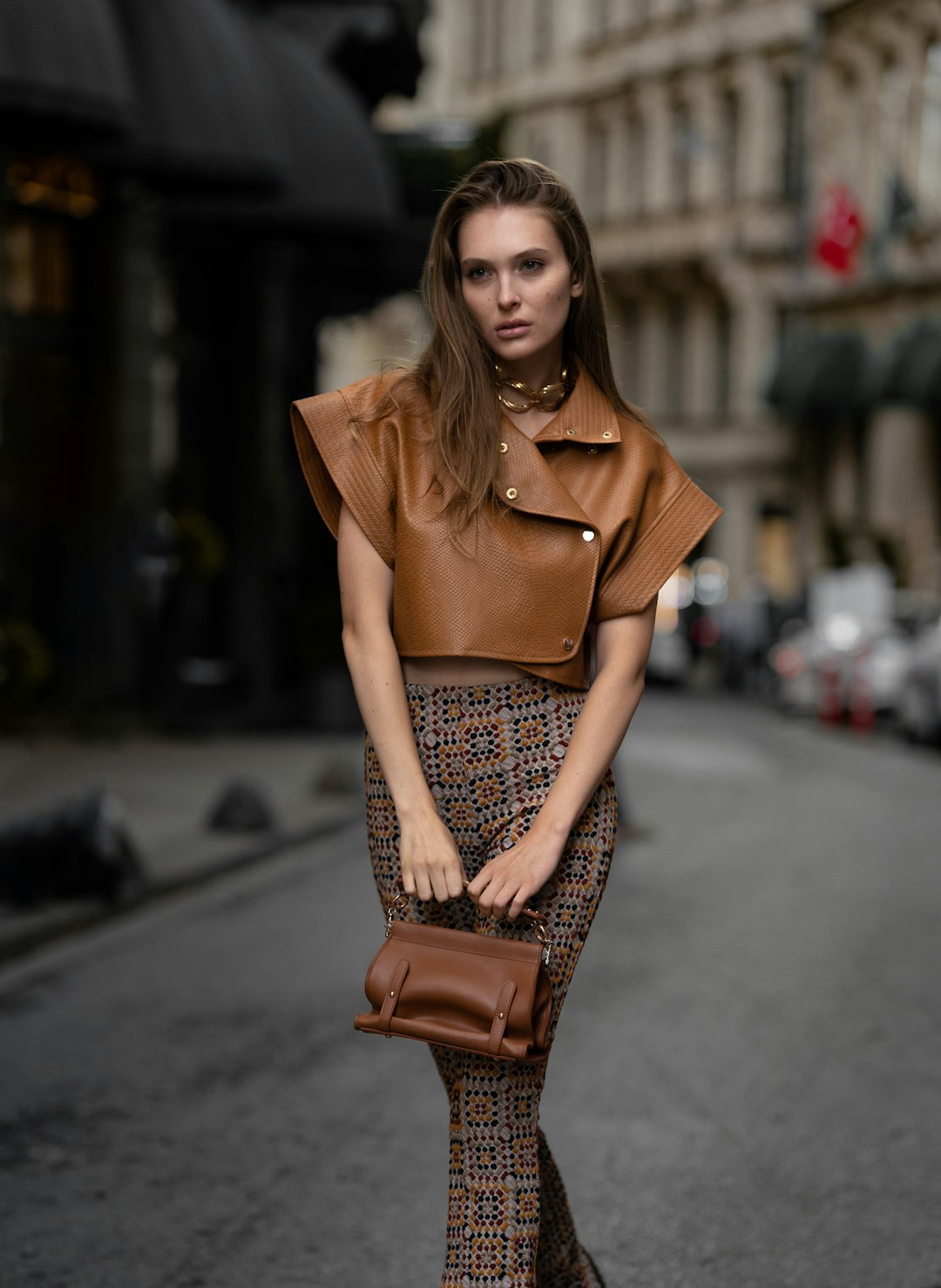
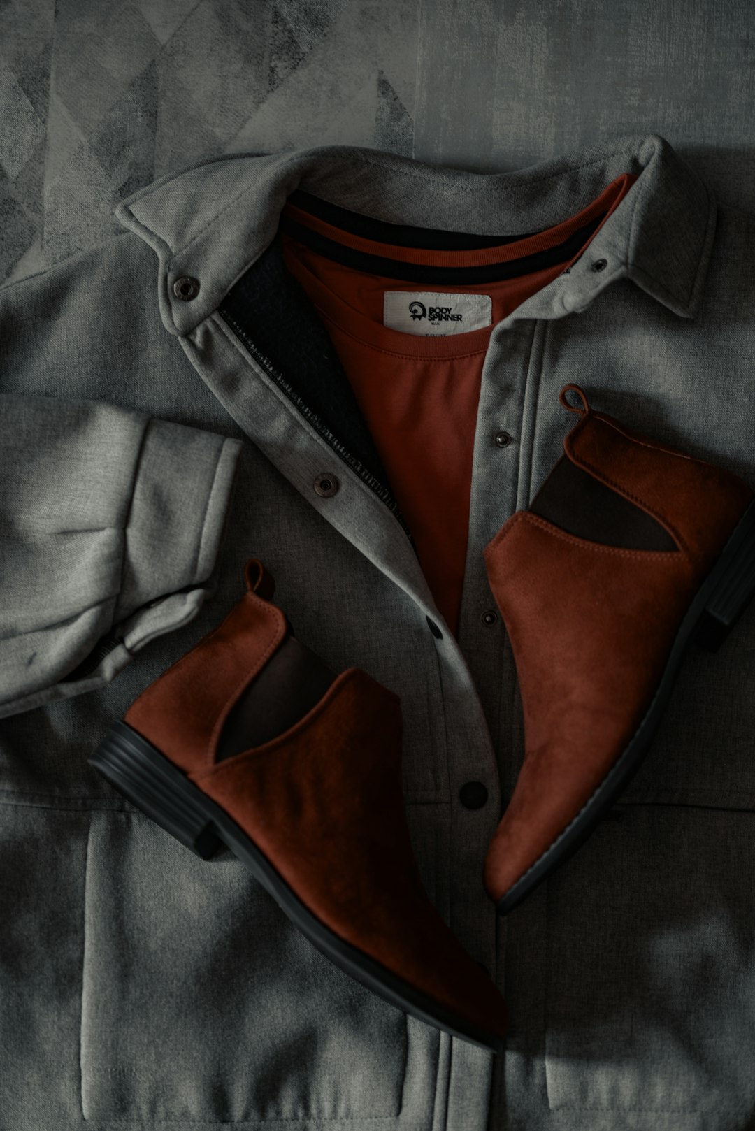
Brown has steadily held a top position in the fashion lover’s world for the past year, but more recently celebrities like Sofia Richie Grainge are backing it as a sophisticated option for evening wear. From red carpets to coffee runs, A-listers are embracing earth tones like they’re the new black. We’re forecasting leopard print, shades of deep brown (especially in monochromatic, head-to-toe looks), hobo bags, and ballet flats for 2025, with these styles spotted on Kelly Clarkson, Rihanna, Meghan Markle, Katie Holmes, and more stars. Think about it – when Meghan Markle steps out in head-to-toe brown, fashion magazines don’t call it a mistake anymore. Deep brown, espresso-colored outfits are becoming a staple in celebrity wardrobes, with stars like Meghan Markle and Katie Holmes being spotted embracing this rich, monochromatic palette, adding sophistication to their ensembles. The shift is so dramatic that what once felt like playing it safe now feels like making a statement.
The Psychology Behind Our Earthly Obsession
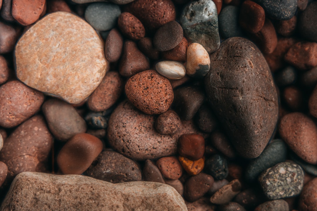
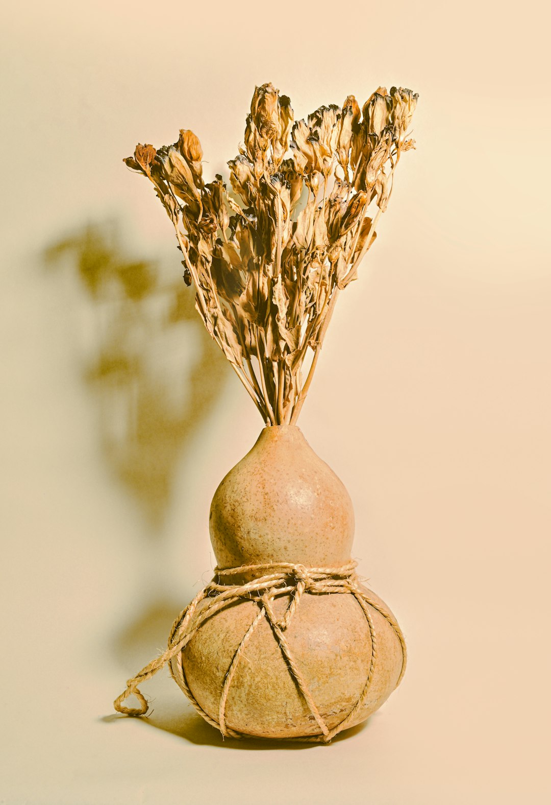
There’s actual science behind why we’re all suddenly gravitating toward these muddy, muted colors. Some of the appeal may be psychological, as there’s a theory called ecological valence theory, which suggests that our color preferences develop based on the emotional experiences we have with those colors over time – shades like deep terracotta can evoke memories of family vacations out west, while a rich green might remind you of hiking adventures with friends. It’s like our brains are hardwired to find comfort in colors that remind us of actual earth – dirt, trees, rocks, all that good stuff our ancestors spent millennia staring at. The meaning of the color brown can vary, but many find it earthy and comforting, often described as natural, down-to-earth, and conventional, but brown can also be sophisticated. These browns have gained momentum due to their association with stability and comfort, as their quiet, natural quality brings a sense of richness and tranquility to any space, transforming it into a personal retreat. Think of it as color therapy, but make it fashion.
Post-Pandemic Healing Through Natural Colors
As the world shut down and everyone’s way of life was altered, many were drawn to the outdoors for healing, and this love for nature continues in the post-pandemic world with design elements like natural light, plants, raw materials and earthly decor – at its core are earth tones. After years of being stuck inside staring at white walls and blue screens, our eyes are literally craving something more organic. In the wake of the Covid-19 pandemic, especially, when outdoor space became essential, many began to realize the importance of a more soothing, natural home environment. It’s like we collectively decided that if we can’t always be outside, we’ll bring the outside to us. The COVID-19 pandemic has significantly impacted people’s psyches, leading many to seek solace and healing in nature, and this desire for connection with the outdoors has translated into a preference for natural colors and materials in interior design. After years of sleek minimalism and stark neutrals, consumers are embracing colors that reflect a sense of grounding and well-being, with an emotional resonance to these tones that reminds us of slow living, meaningful moments, and the warmth of the natural world.
The Sustainability Connection That Actually Makes Sense
Here’s where things get really interesting – earth tones aren’t just trending because they look good. The increasing awareness of sustainability is also fueling the earth tone trend, as earth tones align with the eco-friendly ethos of reducing environmental impact, reflecting the colors of the natural world. Social media has also driven earthly trends in interior design, especially amid a growing interest in sustainability, with influencers posting DIY tips for conscious living and sustainable spaces to improve one’s ecological footprint at home, including things like repurposing furniture and opting for recycled or biodegradable materials integrated into earth-inspired residences. It’s not just about looking natural – it’s about being natural. When you choose earth tones, you’re basically telling the world that you care about the planet without having to wear a “Save the Whales” t-shirt every day. Celebrities like Emma Watson and Leonardo DiCaprio have long championed sustainable fashion, and 2025 sees this trend gaining unprecedented momentum, as embracing eco-friendly materials and ethical production methods is not only stylish but also environmentally responsible.
The Great White Wall Rebellion
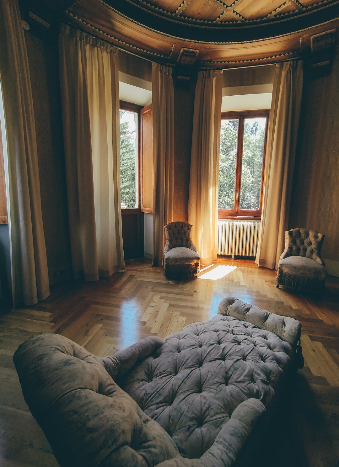
We can now see that the white, stripped-down colors are beginning to be replaced by harmonious earth tones, round shapes, and colors, with the mantra for 2024 being: Dare to make your home personal and create an environment where you want to live and thrive. Remember when everyone’s Instagram feed looked like a minimalist museum? Those days are officially over. 2025 will be all about layers of color, pattern, and texture, with the all-white interior being out. People are basically staging a peaceful revolt against the tyranny of all-white everything. Replace the minimalist white shades with warmer earth tones and colorful details. It’s like we all collectively realized that living in what looks like a fancy psych ward isn’t actually that relaxing. For the last few years, interior designers have embraced warm minimalism as a way to create a calming aesthetic in the home, and in 2025 this trend looks to become more popular than ever, incorporating warm tones and interesting textures, making spaces feel more inviting and comfortable without sacrificing the clean, uncluttered aesthetic.
Tech Meets Terra Firma
In a world where we’re constantly plugged in, earth tones offer a digital detox for our eyeballs. Ever since the pandemic forced us to stay home for a year, we’ve all turned into homebodies who are finally recognizing the undeniable connection between our lived-in spaces and our mental well-being – we’re now seeing the untapped potential our homes have to satisfy so many of our psychological needs. While our phones buzz with notifications and our laptops glow with artificial light, earth tones whisper “chill out” in a language our nervous systems actually understand. All about cocooning yourself in deep and rich colours inspired by the natural world, from spicy cinnamon and lavender to sage green and merlot red, this earthy spin on dopamine dressing taps into the psychological theory that wearing nature’s colour palette has the same soothing, shoulder-lowering effect as actually being among it, stemming from the interiors world where decking rooms in naturally tranquil hues is said to create a sense of sanctuary and safety. It’s like having a built-in meditation app, but for your eyes. Combining calming blues and grounding earth tones can convey both trust and a connection to nature, with an energizing, bright green hue evoking feelings of renewal, growth, and energy, while an earth-tone green can bring a calmer sense of grounding.
The Anti-Perfection Movement
Even though the trend is still in fashion a lot still today, that doesn’t mean the trend or idea hasn’t lost life, as easy as it is to put together something pleasing to the eye with a simple color palette, it limits the ability to express, with fashion moving in a direction that embraces complexity, standing out, bright colors and a “more equals better” mentality. But here’s the plot twist – earth tones are fighting back by becoming the rebellious choice. While 2024 brought interiors closer to nature through tonal browns, the year ahead will broaden the palette to other natural color families, with designer Ghislaine Viñas from ELLE DECOR anticipating moodier and muddier tones throughout design projects, including desaturated hues, dusty blue and clay colors that will be long-lasting. It’s not about being boring anymore – it’s about being intentionally imperfect. Those particular hues from the mid-1970s — like mustard yellow and avocado green — had more movement than today’s colors, but this year, earthy wall colors will have a different quality. Think of it as the fashion equivalent of that perfectly imperfect coffee shop that uses mismatched mugs and somehow makes everything taste better.
The Luxury Makeover Nobody Expected
While butter yellow is surely on your radar already, a richer tone — 24k gold — is popping up on the runways of labels like Bottega Veneta, Saint Laurent, and Gabriela Hearst, emphasizing the impact of a confident hue, and similar to 24k jewelry, with its lustrous, gold nugget-like appearance, this yellow can be incorporated as an accent, contrasted with muted neutrals or layered with a vibrant pattern to punctuate the look. Suddenly, wearing brown doesn’t mean you’ve given up on life – it means you’ve upgraded to first class. At Hermès, camels step in where creams or blacks once dominated, while Bottega Veneta’s ultra-saturated wine red finds its way to dresses and blazers, and Max Mara relies upon deep chocolate browns and khakis for the better half of its most recent offerings – for a truly modern take on the trend, try mixing each with black as it’s refined, elevated, and just the right amount of unexpected. Luxury brands have basically taken earth tones and given them the glow-up of the century. These colors have a versatile nature, effortlessly complementing various design styles, including boho as seen at Etro, traditional as seen at Fendi and Ami, modern as seen at Louis Vuitton, and minimalist as seen at Dries Van Noten and Lemaire.
The Versatility Game-Changer
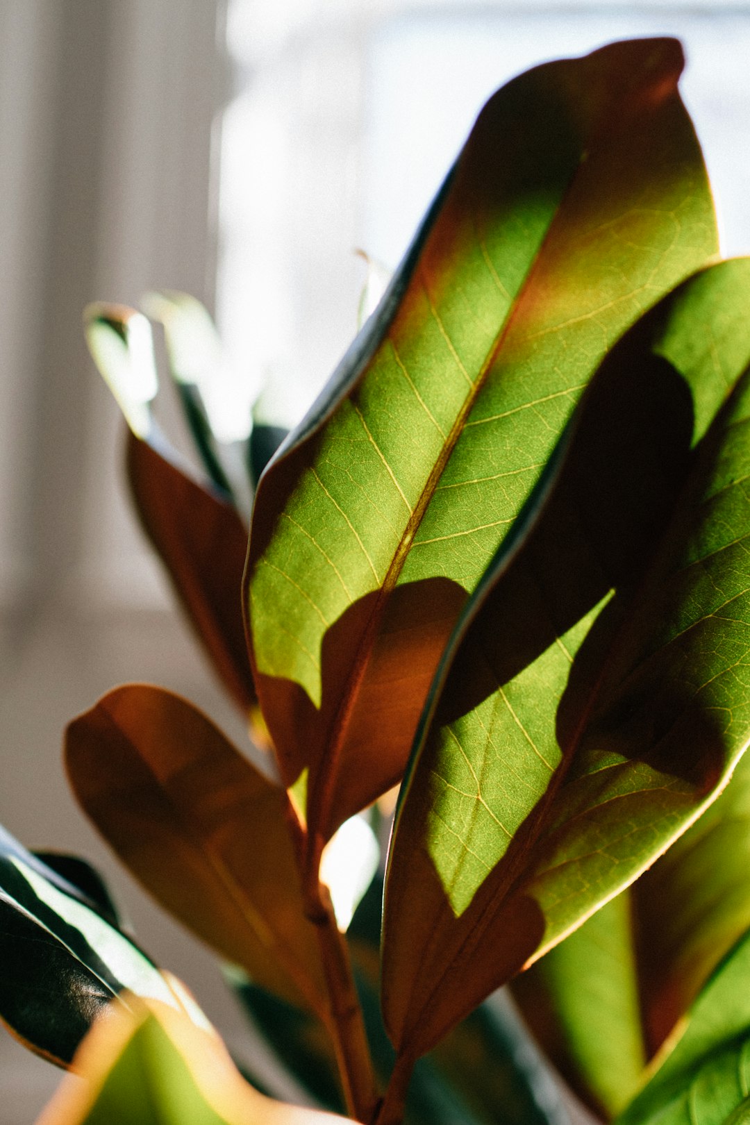
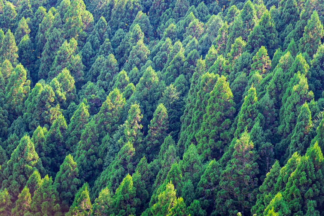
They’re versatile and can evolve with changing decor – whether paired with sleek, modern furniture or vintage-inspired pieces, they always look fresh, and for those who prefer neutral spaces but want a bit of warmth, earthy tones offer that middle ground—rich without being too dramatic. One minute you’re channeling cottagecore with sage green, the next you’re serving boardroom boss energy in chocolate brown. Think earthy browns, forest greens, classic creams and all the neutral tones in between – it’s a nature-inspired palette, and one that is very easy to use when getting dressed for the autumn season, with colors that go very well with denim and pale blue. Earth tones are basically the Swiss Army knife of the color world – they do everything, they go with everything, and they make you look like you know what you’re doing even when you absolutely don’t. Earth tones are forgiving and adaptable, perfect for both open, airy spaces and more intimate rooms, and they’re ideal for creating a consistent color palette throughout a home, making spaces feel cohesive without being too matchy-matchy. Earth tones include shades inspired by nature, such as rich brown, olive green, mustard yellow, burnt orange, and warm wood tones, and these colors create a calming, grounded atmosphere in any space.
The Future Is Muddy (And We’re Here for It)
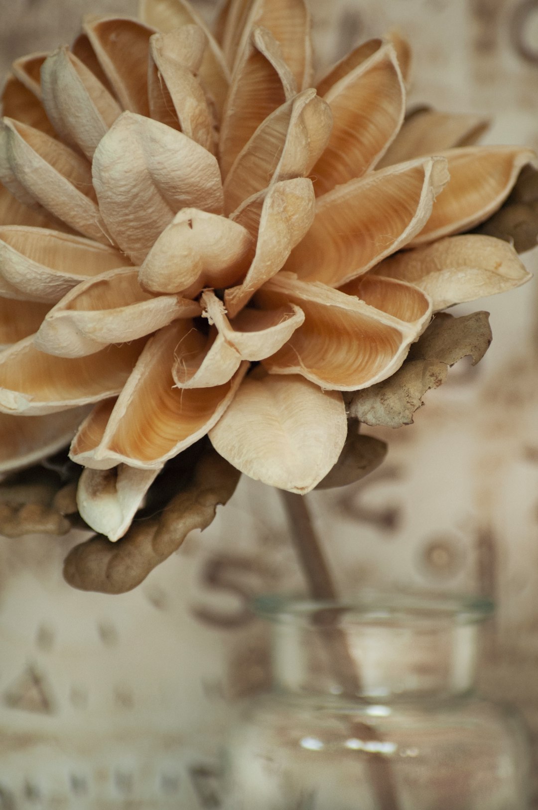
In 2025, the palette of earth tones is expanding beyond traditional browns to include a wider range of natural shades, with designer Ghislaine Viñas from ELLE DECOR anticipating “moodier and muddier tones” throughout design projects, including desaturated hues, dusty blues, and clay colors. Brown isn’t going anywhere in 2025, but you’ll probably see deeper truffle coloring, described as a blend of chocolate and taupe, with other earth-tone wall trends including eggplant, terracotta, grayish-blue, iron oxide and pink with brown undertones. We’re not just talking about your basic beige and brown anymore – we’re talking about colors with names like “truffle” and “iron oxide” that sound like they belong on a fancy restaurant menu. Specific earth tones expected to be popular in 2025 include terracotta (a warm, reddish-brown that adds a touch of vibrancy and energy), sage green (a soft, muted green that brings a sense of calm and tranquility), truffle (a deep, rich brown that combines chocolate and taupe for a luxurious feel), and eggplant (a dark, sophisticated purple with brown undertones). The future of fashion is apparently covered in really expensive dirt, and honestly? We’re digging it.
What would you have guessed – that the colors we once avoided like fashion plague would become the chicest thing since sliced bread served on handmade ceramic plates?

A master of contemporary design, Bobby Burke brings a fresh perspective to home styling. His book Effortless Interiors offers readers a roadmap to achieving sleek, functional, and beautiful spaces with ease.